Custom Tab View
Mon May 02 2016Recently, I had the chance to apply for a job as a UI designer and creative coder at a SAAS start-up. Instead of a long interview and asking for my diploma, the head of design allowed me to prove my design and coding skills in a small challenge.
The Task
We need to make a list of files look cool.
- Toggle the files as tiles and list view.
- We need to be able to toggle between the list and tile view on the screen.
- Bonus: add a filter or search method
- Visually, we are going for if Microsoft had a baby with Apple
- All client-side stuff / hard coding is cool
- Should be responsive
- Layout as you think best
- Style as you wish
- Namespacing things it’s important
The Result
What you see is a customized tab view with a search field above. The search field responds immediately to the given input. So, if you start typing, items in the tab view not matching the given string are sorted out. Below the search field you see the interface for the tab views. For simplicity, I decided to use buttons labeled just with icons that represent the according to view best. Finally, under the buttons you find the tab views. The first one is the list view the other one is the tile view.
The List View
The list view is represented by a classic table. In the briefing, I was asked for thumbnail images in the list view. I could have done that, but in my opinion, it isn’t suitable in this context (I mean what would a thumbnail of an Excel file look like?) and I found it more challenging to pick a matching file icon for the particular file type. So, you see an icon, the name, and the size for each file in a row.
The Tile View
The tile view uses random background images of birds delivered by Lorem Flickr, which is the reason why it takes some time until all images are visible. Additionally that the tiles provide the same information like the list items, the file icon is just a little bit larger. For the background images, I used CSS blend mode, which isn’t all browser compatible but looks pretty cool!
The Process
I started this little experiment in CodePen which is quite handy to quickly test stuff because you don’t have to care about several things in the beginning like boilerplate stuff and importing libraries.
One of the main problems while designing data-driven structures is the data itself. In the past I used to spend a lot of time editing JSON files to fulfill the needs of the particular project until I found JSON Generator. This tool makes designing random data easy. If you need random images you can combine JSON Generator with Lorem Flickr which provides random images.
To handle this kind of data I made a good experience with Underscore.js. It is a small but very powerful library. I use it mainly for templating.
Now it was time to work on the visual representation of the data. Bootstrap has all the components for this interface. So I went for the tab and search field components (and some other components, which are only for decoration like the jumbotron in the header).
Now it was time to think about the filter method. I made a quick research on available jQuery plugins and found, among others, HideSeek, which promised to be easy to implement, and kept this promise. Maybe there are better ones out there, but this could be tested in further iterations.
Because Helvetica isn’t suitable for anything, especially for web and interface design, I needed to change that. I didn’t have to care about long-copy text, so I went for display fonts just for an interesting typographical mix: Montserrat for headlines and primary information and Fairplay Display for secondary information and table labeling.
For better faster editing of the source code, it was time to export the project from CodePen to my computer. For projects at this scale I use Codekit for CSS compilation and Javascript linting.
In this task Less is the CSS preprocessor of choice. I wrote some mixins for quickly adding the right font for the particular element or class and one which takes care of choosing the right file icon, which is provided by Font Awesome like the icons in the tab navigation.
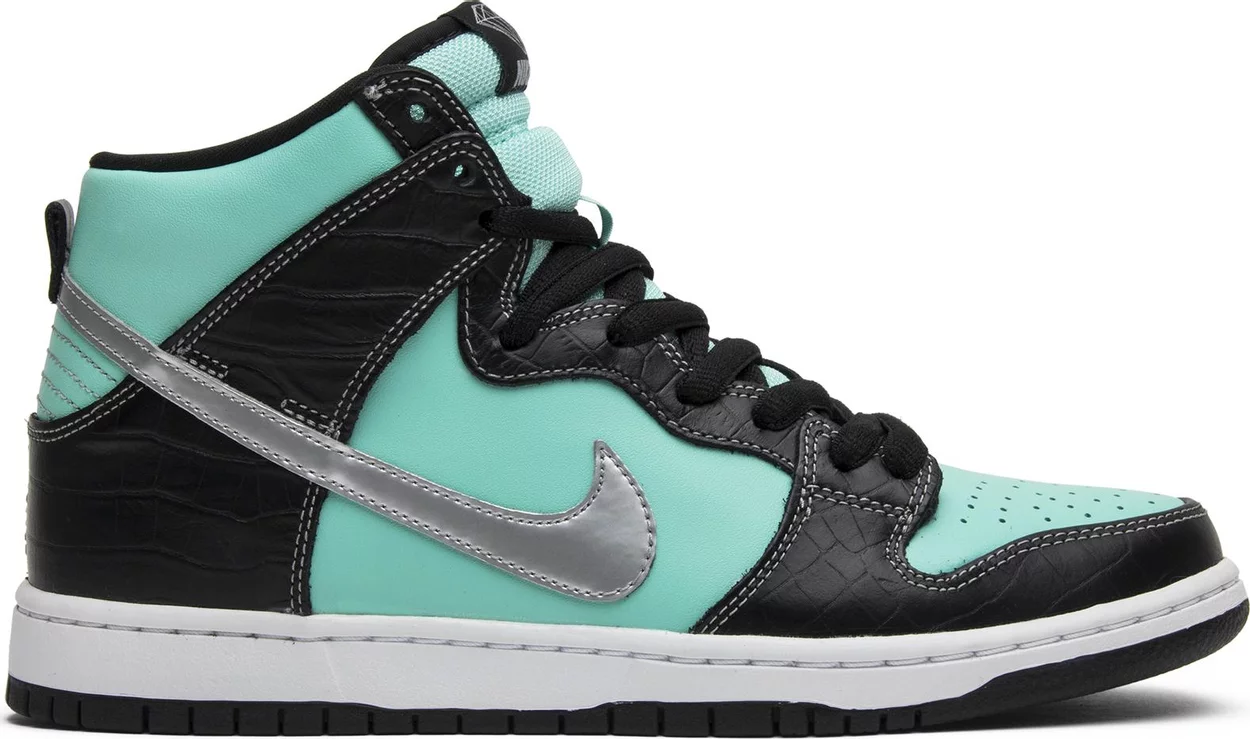
After I have chosen a color theme that was influenced by this sneaker:

I moved the code back to CodePen just to have another good looking experiment in my portfolio.
Resources
Libraries & Frameworks
- Bootstrap · The world’s most popular mobile-first and responsive front-end framework.
- Underscore.js
- HideSeek: A simple, mobile-friendly, yet customizable quick/live search jQuery plugin.
Fonts
Tools
- CodePen
- JSON Generator – tool for generating random JSON data
- LoremFlickr: free placeholder images
- Less.js
- CodeKit: THE Mac App For Web Developers
Conclusion
I really enjoyed the task! I don’t know if the style is »… if Microsoft had a baby with Apple«, I would describe it more like »Edward Tufte discovered the fun of colors«.
Best regards,
Pete